BEHAVIOUR & INFORMATION TECHNOLOGY, 1989, VOL. 8, NO. 1, 33-42.
(c) Copyright 1989 Taylor and Francis Ltd.
http://www.tandf.co.uk/journals
Reading Dynamically Displayed Text
T. JIN KANG and PAUL MUTER
Psychology Department, University of Toronto, Toronto, Ontario, M5S 3G3, Canada
Address correspondence to Paul Muter, Department of Psychology, University of Toronto, Toronto, Ont., M5S 3G3, Canada
muter@psych.utoronto.ca
Abstract. Two experiments were carried out to find an optimal electronic text display method given limited display space. The display formats tested fell into two categories: Times Square, in which text is scrolled from right to left; and rapid, serial, visual presentation (RSVP), in which text is presented one or several words at a time to a fixed location in the display. Previous studies have indicated that Times Square format is not as efficient as page format display or, by extrapolation, as RSVP. These studies, unlike the present experiments, did not include a smooth-scrolling (pixel-by-pixel) condition. In Experiment 1, a comparison was made between multiple-word RSVP and three versions of Times Square format, differing only in the size of steps by which the display was scrolled. Except for the largest step-size, comprehension was as high in the Times Square conditions as in the RSVP condition. The subjects expressed a significant preference for smooth scrolling Times Square over any other condition. Experiment 2 showed that comprehension for smooth scrolling Times Square was at least as high as that for RSVP at presentation rates ranging from 100 to 300 words per minute. Times Square reading is discussed in terms of optokinetic nystagmus (OKN).
1. Introduction
Electronic information display systems are becoming a common sight in public places such as airports, subways, shopping malls, etc. They can also be found on cable TV and wrist watches. Most of these systems employ cathode ray tubes, liquid crystal displays, gas plasma displays, or light-emitting diodes as the output device. (For more information on these display devices see Pucilowski and Schlam 1978). Some of these systems are operated interactively. The user can choose the information she/he desires and read it at her/his own pace. Non-interactive systems display information in a predetermined order at a preset speed. If the information does not fit in one screen page the text is either scrolled or shown one page at a time. The user has no control over the rate of scrolling or the length of time a page is shown. One advantage of the non-interactive system is that it can be used simultaneously by many users. In this paper, discussion will be limited to one-line non-interactive display systems.
Most of the display techniques used fall into two categories: Times Square and rapid, serial, visual presentation, or RSVP. In the times Square technique, named after Times Square in New York City, where the most famous implementation of this technique is found, the text is scrolled horizontally, from right to left, in a one-line display. (Vertical scrolling, which has been studied with full-sized displays by Kolers et al. 1981, is rarely used in one-line displays.) In RSVP, text is presented one or several words at a time at a fixed location in the display. Thus, the distribution of the text is temporal instead of spatial. RSVP has been used by many psychologists as a tool for studying reading behavior (Forster 1970, Gilbert 1959, Juola et al. 1982, Potter et al. 1980). It has been shown that people can read text presented in RSVP format with approximately the same speed and comprehension as they can read passages of text presented in page format (Juola et al. 1982, Masson 1983).
Despite the popular use of Times Square displays in the real world, this display format has not been studied extensively in a laboratory setting. Sekey and Tietz (1982) compared Times Square format with page format, in which information is presented one page at a time, and with 'saccadic scrolling', in which a text is flashed on to a display one line at a time. Sekey and Tietz found that text was read significantly more slowly in Times Square mode than in either saccadic scrolling or page mode. Furthermore, comprehension scores were lowest for the Times Square mode, though the differences were not statistically significant.
Granaas et al. (1984) presented text in a format called 'leading', another term for Times Square, in which the text was moved in discrete jumps of one or more characters at a time from right to left. Reading comprehension in this format was worse than in page format. Granaas et al. compared the results of their study to the results of previous RSVP studies and suggested that the Times Square format is probably inferior to the RSVP method of text presentation. Granaas et al also found that the two-letter jump condition gave rise to worse reading performance than the one, four, six, eight, and ten letter conditions. They explained this curious finding as follow: 'the pause duration in the two-jump condition of 88 ms was too brief to allow for an adequate eye fixation; at the same time, the pause might have been too long and the jump too far to allow for following the text with the eyes in a continuous manner' (p. 100). Because of equipment limitations in the experiment, as in the Sekey and Tietz study, Granaas et al. did not study the most common version of the Times Square format, which employs pixel-sized jumps and gives the appearance of continuous motion. In both papers, it was speculated that with a continuous Times Square display method, the results might have been different.
Using a comprehension test which required readers only to indicate whether text had been altered in a second presentation, Monk (1984) found no statistically significant differences among a three-letter jump condition, a six-letter jump condition, and an RSVP condition (Experiment 1). Monk used reading rates over 500 words per minute, which is much faster than normal.
In the present study, a laboratory technique for continuous (pixel by pixel) horizontal scrolling is introduced, and an attempt is made to find an optimal method for presenting text on a non-interactive electronic information display device for which display space is limited. The continuous form of Times Square format is compared with RSVP and with the previously studied less continuous Times Square formats.
2. Experiment 1
In this experiment, subjects read passages of text from a computer screen. The passages were presented using four different display formats. Three of the formats employed the Times Square method and differed from each other only in the size of steps by which the text moved across the screen. The fourth format was RSVP.
In the Pixel Times Square condition the text was shifted within the viewing area by one pixel at a time to the left. Though this is the most commonly used technique in commercial displays, no study on its effectiveness has been carried out. The Letter Times Square condition, in which the text was shifted by one letter to the left, was similar to the technique used by Granaas et al. (1984) and Sekey and Tietz (1982). In the Word Times Square condition, the text was shifted to the left by the width of the left-most word in the viewing window.
In order to make the Times Square and RSVP conditions as similar as possible, multiple-word RSVP was used instead of one-word RSVP, since the typical Times Square display holds more than one word at any given moment. This choice of multiple-word RSVP over single-word RSVP for comparison with the other display techniques does not put RSVP at a disadvantage, according to data from previous studies (Cocklin et al. 1984, Juola et al 1982).
2.1. Method
2.1.1. Subjects
Twenty-four University of Toronto students participated in the experiment. Some subjects participated for course credit and some were paid.
2.1.2. Materials
Subjects read 20 nonfictional passages chosen from the 40 paragraphs used by Masson (1983). The passages were originally published in Reader's Digest and were not related to each other. The mean length of the passages used was 124 words.
For each passage, ten short-answer questions were given to test comprehension. The questions were taken from Williamson (1985). To establish a baseline correct response rate, Williamson gave the questions to a group of 20 control subjects who had not read the passages. The mean comprehension score for the 20 passages was 2-3%.
2.1.3. Apparatus
The passages and the comprehension questions were displayed in upper and lower case letters on the screen of a Macintosh microcomputer. The screen dimensions were 16.5 x 10 cm. The resolution of the screen was 512 x 342 pixels. A 12 point sans serif variable width font called 'Geneva' was used for both Times Square and RSVP displays and also for the comprehension questions. The maximum matrix size was 9 x 12 pixels. The characters were black on white background.
A 3 x 0.7 cm rectangle drawn in the middle of the screen defined the viewing area. Both Times Square and RSVP text were displayed within the boundary of this viewing window. From the viewing distance of approximately 50 cm, the 3 cm wide viewing window subtended approximately 3.4 degrees of horizontal visual angle.
2.1.4. Presentation techniques
In all of the Times Square conditions, the letters in the text entered the viewing area at the right edge of the window and moved to the left. The gap created at the right edge of the viewing window by these movements was filled by displaying as much of the remaining text as could be fitted in the viewing area. If all of the first or the last letter in the window did not fit in the viewing area only the portion of the letter that fitted was displayed. When the last letter of a passage disappeared from the viewing area at the left edge of the window, the whole screen was cleared and the prompt for questions appeared on the screen. In Pixel Times Square, the text was shifted within the viewing area one pixel at a time, thereby giving the appearance of smooth, continuous motion. In Letter Times Square, the shift was done 11 pixels at a time, i.e., equal to the width of the widest character, the letter 'm', plus two blank pixels. In Word Times Square, the text was shifted to the left by the width of the left-most word. The average number of letters in the window in the Times Square conditions was 12. Since the RSVP condition had the usual 500 ms pause at the end of each sentence (during which time the screen was blank), an appropriate blank space followed the end of each sentence, in the Times Square conditions.
In Pixel Times Square, each display remained stationary for an average of approximately seven ms prior to being shifted. The total display duration of each passage was based on the number of letters in that passage, the width of individual letters, and the number of sentences. As a consequence, the reading rate in words per minute was not equal for each passage and ranged from 172 to 253 with an average of 194. However, by varying the length of the stationary period for each passage in the Letter and Word Times Square conditions, the total display duration for a particular paragraph was the same in all conditions. The average stationary period was 103 ms for Letter Times Square and 288 ms for Word Times Square.
In the RSVP condition, passages were displayed several words at a time, in serial order. The number of words shown in the viewing area was the maximum number of whole words that could fit in the viewing window. Each word or group of words was centred within the viewing area. The average number of words in a window was 17. Consistent with Masson (1983) and others, there was a 5OO ms pause following the display of the last word(s) of each sentence. Each RSVP display, regardless of the number of words in the display, stayed on the screen for a fixed period of time. The actual duration of each display varied as a function of passage and ranged from 433 ms to 449 ms. These adjustments were necessary to make the total display duration for a particular passage in the RSVP condition the same as in the Times Square conditions.
2.1.5. Procedure
At the beginning of the session the subject was shown sample sentences of the four display conditions in the order of their appearance in the actual experiment, and was told that five consecutive passages would appear in each condition. Each of the 24 subjects who participated in the experiment was assigned one of the 24 possible orders of the four conditions. The order in which the passages were presented was randomized for each subject.
Each passage was followed by a set of ten comprehension questions. The questions appeared on the computer screen one at a time and stayed on the screen for a 10 s period. A beep signaled the end of each 10 s period. The order of the comprehension questions for each passage was randomized for each subject. The subject wrote down the question numbers and the answers to the questions in the booklet provided for that purpose.
After the subject was given instructions, he or she was left alone to complete the session. Presentation of a passage or a set of questions was initiated by pressing any key at the keyboard. Brief rests were permitted after answering a set of questions and before reading the next passage. Most subjects finished the session in less than one hour. After completing the last set of questions, the subject rank-ordered the four conditions in terms of preference. (The practice trials were shown again to refresh the subject's memory about the conditions.)
2.2. Results
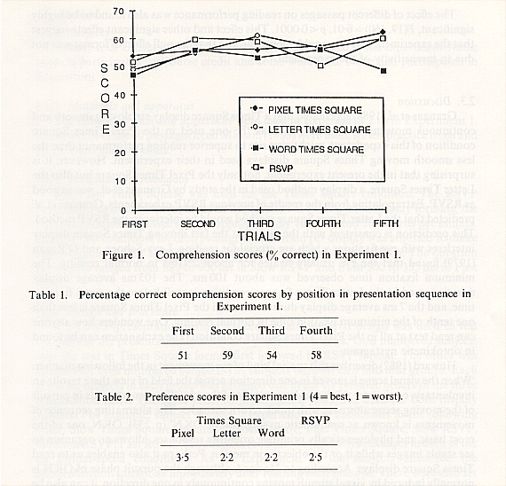
Mean percentage comprehension scores are presented in figure 1. A 4 x 5 (presentation format x trials) within-subjects analysis of variance showed that the effect of presentation formats was not significant, F(3, 384) = 1.80. The mean scores for RSVP, Pixel, Letter, and Word were 56, 57, 56 and 52 respectively.

The effect of trials was almost significant, F(4,276) = 2.23, p < 0.10. Figure 1 suggests that the subjects' reading performance was the worst during the first trial within each display condition.
It was revealed through a within-subjects analysis of variance that the position in the presentation sequence-i.e., whether the condition was presented first, second, third, or last-was significant, F(3,384) = 4.98, p < .002. The mean comprehension scores for positions in the presentation sequence are summarized in table 1. It is possible that the subjects did poorly in the condition that appeared first, regardless of the display format, because of their unfamiliarity with the experimental situation.
Preference ratings collected from each subject were converted to preference scores. A score of 4 was assigned to the condition rated as the best, and 1 to the worst. The mean preference score for each display format can be seen in table 2. A Friedman analysis of variance revealed that the effect of conditions on preference was highly significant, Chi-square (3) = 18.7, p < 0.001. Sixteen of the 24 subjects chose Pixel Times Square as their first preference.
The effect of different passages on reading performance was also found to be highly significant, F(19,460) = 6.01, p < 0.0001. This effect and other significant effects suggest that the experiment was reasonably powerful, and that the null effect of format was not due to insensitivity of the experiment.
2.3. Discussion
Granaas et al. (1984) speculated that a Times Square display employing smooth and continuous movement of letters, such as the one used in the Pixel Times Square condition of this experiment, might give rise to superior reading performance than the less smooth moving Times Square displays used in their experiment. However, it is surprising that in the present experiment, not only the Pixel Times Square but also the Letter Times Square, a display method used in the study by Granaas et al., was as good as RSVP. Extrapolating from the results of previous RSVP experiments, Granaas et al. predicted that the Letter Times Square method would be inferior to the RSVP method, This prediction is consistent with the view that the fast moving Times Square display interferes with eye fixations which are crucial for reading. Levy-Schoen and O'Regan (1979) found that the eye usually fixates for about 250 ms in normal reading. The minimum fixation time observed was about 100 ms. The 103 ms average display duration used in the Letter Times Square condition is well below the usual fixation time, and the 7 ms average display duration used in the Pixel Times Square is less than one tenth of the minimum fixation time in normal reading. One wonders how anyone can read text at all in the Pixel Times Square condition. The explanation can be found in optokinetic nystagmus.
Howard (1982) describes this special kind of eye movement in the following manner. 'When the visual scene is moved in one direction across the field of view there results an involuntary, conjugate, rhythmical movement of the eyes. Slow movements in pursuit of the moving scene alternate with quick return saccades. The alternating sequence of movements is known as optokinetic nystagmus, or OKN' (p. 233). OKN, one of the most basic and phylogenetically primitive orienting responses, allows an organism to see stable images while it or the object is in motion. Perhaps it also enables us to read Times Square displays. According to Howard, although the pursuit phase of OKN is normally induced by visual stimuli moving continuously in one direction, it can also be induced by a target that moves in discrete jumps as long as time intervals between target positions are short enough for the sequence to resemble a continuous movement.
3. Experiment 2
In Experiment 1, it was found that at a 194 words per minute reading rate, there was no significant difference in comprehension between the Times Square formats and RSVP. This 194 words per minute rate is somewhat slower than the 280 words per minute normal reading speed of college students reported by Taylor et al. (1960), and slower than the 272 words per minute rate used by Granaas et al. (1984). It is possible that the Times Square format may give rise to worse reading performance than RSVP at a higher rate of presentation. Our perceptual apparatus may not be able to track a target moving at a faster rate. If this is the case, an increase or decrease in the rate of presentation should affect Times Square and RSVP differently. In Experiment 2, comparisons of the Times Square and the RSVP formats were made at three different presentation rates, 100, 200, and 300 words per minute.
3.1. Method
3.1.1. Subjects
Twenty-four University of Toronto students participated in the experiment. Some subjects participated for course credit and some were paid. None had participated in Experiment 1.
3.1.2. Materials and apparatus
The same materials and apparatus were used in Experiment 2 as in Experiment 1. However, 24 of the 40 passages from Masson (1983) were used, six for practice trials and 18 for experimental trials.
3.1.3. Presentation techniques
The Pixel Times Square was used for the Times Square condition. The RSVP condition was exactly the same as in Experiment 1. Within both display formats, the text was presented at three speeds: approximately 100, 200, and 300 words per minute. In the RSVP condition, for each passage the duration per display was adjusted to make the total duration for the passage equal to the Times Square condition. The duration per display ranged from 883 to 950 ms in Slow RSVP and from 300 to 333 ms in Fast RSVP.
3.1.4. Design and procedure
A 2 x 3 x 3 (presentation format x speed x trials) factorial design was used to test the effect of the presentation formats and presentation rates. Odd numbered subjects read the text in Times Square format first followed by RSVP format. The order was reversed for even numbered subjects. The subjects were divided into four groups. Each of the six subjects in each group was assigned one of the six possible orders of the three presentation rates. The same order of presentation rates was used for both display formats. For example, subject number 1 experienced the conditions in the following order: Slow Times Square, Medium Times Square, Fast Times Square, Slow RSVP, Medium RSVP, Fast RSVP. The subjects read three consecutive passages in each of the six format-speed conditions. As in Experiment 1, the subjects answered the comprehension questions immediately after reading each passage. There were also six sample presentations, one for each format-speed condition. The order of the passages was randomized for each subject.
3.2. Results
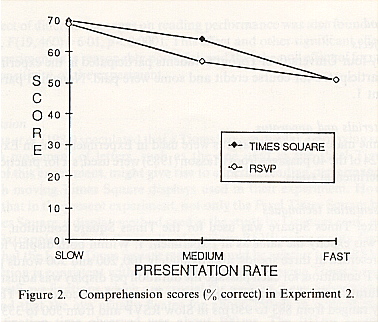
The mean percentage correct in each condition is shown in figure 2. These data were analysed using a 2 x 3 x 3 (presentation format x speed x trials) within-subject analysis of variance. As expected, the results showed that with an increase in presentation rate comprehension seems were lowered, F(2,288) = 33.48, p < 0.0001. The main effect of the presentation formats did not quite reach the level of statistical significance, F(1,288) = 2.95, p = 0.087. No interaction between speed and format was observed, F(2,288) = 1.48, p = 0.23.

4. General discussion
The results obtained in the current study show that Times Square is as good a text presentation technique as RSVP, and is preferred by readers. Granaas et al. (1984) and Sekey and Tietz (1982) found that the Times Square format gave rise to inferior reading performance than normal page format, and, through extrapolation, than RSVP. In the present experiments, the smooth scrolling the subjects saw in the Pixel Times Square format was perhaps more effective in inducing OKN than the jumpy displays the subjects saw in the previous studies. However, in Experiment 1, even the Letter Times Square condition was found to be as efficient as RSVP. This result is contrary to the findings obtained by Granaas et al. and Sekey and Tietz. The reason for the difference may be found in the following observation made by Granaas et al. (1984). 'The subjective results [of seeing text in the Times Square format] is not a smooth or continuous movement of the text; rather, the discrete jumps are quite noticeable' (p. 98). In the current study, most subjects reported that the scrolling in the Letter Times Square was fairly smooth. Some subjects even had trouble distinguishing the Pixel and Letter Times Square formats during the preference rating. This difference in subjective impression is probably due to the different characteristics of the displays used in the studies. Unlike the terminals used by Granaas et al. and Sekey and Tietz, the Macintosh computer employed in the current study has a screen with superior resolution and relatively quick decaying phosphors. The more advanced hardware in conjunction with the variable width font probably made the Letter Times Square display appear more continuous than the corresponding Times Square displays used in the earlier studies.
Clearly, there are situations in which RSVP can be more effective than Times Square. For example, when the viewing window is narrow and presentation rate is high, RSVP may be the more suitable display method. In Times Square format in this case, the words to be fixated may move out of the viewing area before they can be fixated properly. There are situations in which RSVP may be more effective than not only the Times Square format but also the page format display. Since, as Porter et al. (1980) found, RSVP is a good method of ensuring that every word is read, RSVP may be an efficient way to search through lists or texts for specific words, names, or ideas. Such scanning is becoming increasingly important as the amount of information available in the world increases. In addition, RSVP may be a good training tool for teaching better reading habits (Potter 1984). The serial presentation of words may be helpful to some unskilled or disabled readers because it paces the reader and prevents regressions. Finally, work by Williamson et al (1986) suggests that RSVP may help readers with impaired peripheral vision.
In normal reading, the general pattern of eye movements is well known. There is a succession of alternating fixations and saccades, with some of the saccades being regressions. (Setting aside the issue of whether regressive eye movements are desirable, Taylor et al. 1960, observed that 19% of saccades for a typical reader were regressive. Muter et al. (1988) have experimented with different ways of providing regression capability in RSVP reading, with varying success.) The pattern of eye movements in Times Square format is unknown, but it is possible, and perhaps likely, that OKN occurs: i.e., that there is a succession of alternating slow pursuit movements and saccades, with some saccades in the reverse direction. In other words, in Times Square format the pattern may be the same as with normal reading, with slow pursuit movements substituted for fixations. In RSVP, on the other hand, if there are eye movements it is difficult to imagine an eye movement pattern that would mimic the eye movement pattern in normal reading. The perceptual processes involved in reading text in Times Square format, as opposed to RSVP format, may be more akin to normal reading processes. This may explain subjects' preference for the Times Square format.
Acknowledgments
This paper is based on an M.A. thesis by the first author. We thank Susanne Ruschka and Linda Tilley for assistance, and Ronald Baecker and William Hockley for useful comments. This work was supported by Natural Sciences and Engineering Research Council of Canada grants UO149 and G1779 to the second author.
References
Cocklin, T. G., Ward, N.J., Chen, H.C., and Juola, J. F., 1984, Factors influencing readability of rapidly presented text segments, Memory & Cognition, 12, 431-442.
Forster, K.L., 1970, Visual perception of rapidly presented word sequences of varying complexity, Perception and Psychophysics, 8, 215-221.
Gilbert, L.C., 1959, Speed of processing visual stimuli and its relation to reading, Journal of Educational Psychology, 55, 8-14.
Granaas, M.M., McKay, T.D., Laham, R.D., Hurt, L.D., and Juola, J.F., 1984, Reading moving text on a CRT screen, Human Factors, 26, 97-104.
Howard, I.P., 1982, Human visual orientation (New York: John Wiley & Sons Ltd).
Juola, J.F., Ward, N.J., and McNamara, T., 1982, Visual search and reading of rapid, serial presentation of letter strings, words, and text, Journal of Experimental Psychology: General, 111, 208-227.
Kolers, P.A., Duchnicky, R.L., and Ferguson, D. C., 1981, Eye movement measurement of readability of CRT displays, Human Factors, 23, 517-527.
Levy-Schoen, S., and O'Regan, K., 1979, The control of eye movements in reading. In P. A. Kolers, M.E. Wrolstad and H. Bouma (eds), Processing of Visible Language, Vol. I (New York: Plenum Press).
Masson, M.E.J., 1983, Conceptual processing of text during skimming and rapid sequential reading, Memory & Cognition, 11, 262-274.
Monk, A. F., 1984, Reading continuous text from a one-line visual display, International Journal of Man-Machine Studies, 21, 269-277.
Muter, P., Kruk, R., Buttigieg, M.A., and Kang, T.J., 1988, Reader-controlled computerized presentation of text, Human Factors, 30, 473-486.
Potter, M.C., 1988, Rapid serial visual presentation (RSVP): A method for studying language processing. In D. E. Kieras and M.A. Just (eds), New methods in reading comprehension research (Hillsdale, NJ: Erlbaum Press).
Potter, M.C., Kroll, J.F., and Harris, C., 1980, Comprehension and memory in rapid sequential reading. In R. Nickerson (ed), Attention and Performance VIII (Hillsdale, N.J.: Erlbaum).
Pucilowski, J.j., and Schlam, E., 1978, Emerging display devices, IEEE Trans Electronic Devices, 25, 167-171.
Sekey, A., and Tietz, J., 1982, Text display by 'saccadic scrolling', Visible Language, 16, 62-76.
Taylor, S.E., Frackenpohl, H., and Pettee, J. L., 1960, Grade level norms for the components of the fundamental reading skill, EDL research and information bulletin, no. 3. (Huntington, NY: Educational Development Laboratories).
Williamson, N.L., 1985, Rapid serial visual presentation: Some theoretical and applied implications, Unpublished master's thesis, University of Toronto, Toronto.
Williamson, N.L., Muter, P., and Kruk, R., 1986, Computerized presentation of text for the visually handicapped. In E. Hjelmquist and L.-G. Nilsson (eds), Communication and handicap: Aspects of psychological compensation and technical aids (North-Holland: Elsevier Science Publishers B. V.).
