Portal UI - DeAgostini Mockup
Here are the mockups that DeAgostini provided us with a few months ago. They seemed a little upset that some of the ideas weren't included in Prototype 1.2 (particularly their vision of the lightbox), should we re-evaluate our opinion of it?
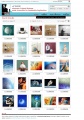
Search Results
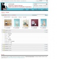
Lightbox


Comments[edit]
Richard[edit]
Personally I think this is a better design than what we have for eCHASE, but it's still lacking some things. The use of ID as a caption isn't very meaningful, and the search box at the top, whilst compact, is not detailed enough to allow users to perform useful searches whilst viewing their results (which is really the search box is on the results page in the first place).
The lightbox is obviously very similar to the one that we have in eCHASE as a java applet - why did we choose to use a java applet instead of their Javascript implementation?
It is also interesting to note how markedly different this UI is to the likes of Corbis and Getty.
11:36, 20 Jan 2006 (GMT)