Developer:UI
The myExperiment User Interface
By Jiten Bhagat, 4th August 2008.
The myExperiment user interface (UI) has been designed, implemented and evaluated in a fully user driven manner, with a focus on discoverability, simplicity, consistency, familiarity and utility – many of the tenets of ‘Web 2.0’. By embedding developers with both end users and power users, we have evolved the UI continually and yet in a manageable fashion, making sure that usability and user experience are top priorities. We regularly engaged these users through design mock-ups, questionnaires, evaluation sessions and informal meetings/chats. This has proven invaluable in ensuring we meet the needs of our user base.
Countless hours have been spent tweaking styles and layout to ensure that the myExperiment UI provides a rich user experience. From appropriate usage of Asynchronous Javascript and XML (AJAX) techniques to ensuring that the UI is as consistent as possible across different browsers and different platforms, we have, from day one, placed a huge emphasis on the end user experience. In this section we present the overall design of the myExperiment user interface and demonstrate examples of how we focused on discoverability, simplicity, consistency and utility.
One particular design challenge was the Packs feature on myExperiment. The way in which we implemented these, from a usability and user interface perspective is also discussed.
Overall Design
myExperiment is a social networking and sharing website and as such builds on the successful design metaphors and patterns prevalent in Web 2.0 style web applications, largely revolving around simplicity. However, these are highly subjective and are only effective when used appropriately and judiciously. We have worked hard to create a balanced user interface in myExperiment, achieved through user engagement and feedback, and by focusing on the factors mentioned previously.
When a user first accesses myExperiment, they are presented with a ‘front’ page which aims be a starting point for new and old users, with a focus on providing information about what users can do on myExperiment (laid out in task-oriented fashion) and other information about the project and website. This page is different to the ‘home’ page which focuses on the latest content on the site (workflows, files, users, groups, tags, comments and so on). When a user is logged on, a latest news feed is also shown on this home page (specific to the user logged on). This notion of having two separate main pages is important in helping ease new users to the website.
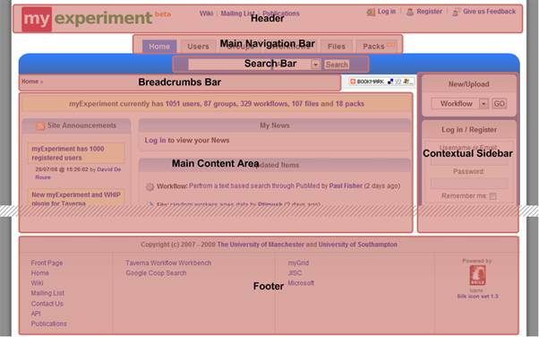
All pages apart from the front page follow a simple page structure that contains a header, main navigation bar, search bar, breadcrumbs bar, contextual sidebar, main content area and footer (see figure below).
We found that this consistent and simple layout helped users navigate the site much more easily and created a sense of familiarity. All the sections have a big focus on navigability and discoverability – they allow users to quickly get to various different parts of the site, and to relevant content. This is especially the case for the contextual sidebar which aims to be specific to the current user (when a user has logged on) and has been a very successful device in allowing users to quickly navigate to their own content. Furthermore, from the figure above, the inclusion of a “bookmark” drop down menu allows users to easily bookmark any page in myExperiment (using the popular addthis.com service, which connects to many different online bookmarking services). In an attempt to make the myExperiment system configurable, this feature can be “switched off” in the main configuration file for others who have installed myExperiment on their own servers.
myExperiment is largely about social data and as such pages are often focused on one social object (for example a workflow, user, group and so on), which becomes the root for pivoting, browsing and so on. When viewing these different types of social objects it was important to have consistent features (as well as consistent styles) so that users wouldn’t have to learn the same or similar things more than once. Two good examples of this are tagging and commenting. Many things can be tagged and commented on in myExperiment but the mechanisms to do these are the same throughout the site.
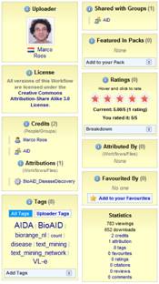
For these social objects, the data that users first look at and are interested in are the “social metadata” such as who uploaded, who has been credited and attributed, what tags it has, what ratings it has and so on (so not the actual data itself and not other metadata). In myExperiment we follow a convention to place most of these social metadata pieces in boxes of a specific box style (see figure to the left), and usually to the right of the social object. This allows us to highlight this information to the user and ensure it is easy to find. To aid discoverability, we make sure that anything that can be linked to is clickable (this applies to the whole site and not just the social metadata). From our usability evaluations we find that users really like this about myExperiment. In myExperiment, the use of specific styles (especially for boxes) aids in familiarity and consistency. We have already seen this with the social metadata boxes. Other styles include instructions/help text box, a box style for data that needs to stand out, a box style for information or actions that are very user specific (in other words contextual), a box style for editing information and text styles for errors and also the presence of no information.
Another important consideration was to make the layouts of similar types of pages (in other words upload/new pages, index pages, show pages and so on) consistent across the different types of data.
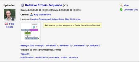
Table listings (see figure below) are also made to look as consistent as possible, with an image on the left, information in the middle and actions on the right.
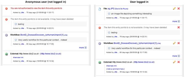
myExperiment caters for many different user contexts – users who are just browsing anonymously, users who are logged in, admin users and so on. Furthermore, a crucial aspect is that only content that is authorised to be shown is shown to the current user based on context (the ‘home’ page is an example of a page that is highly filtered based on sharing permissions). As a result, many parts of the UI are very dynamic and different content and features and actions are shown/enabled based on the current user context.
The figure above shows the exact same UI section (some items in a pack) but in different contexts (one when an anonymous user is viewing it and another when a user has logged in). We can see different actions available as well as one content item explicitly blocked. This is an example of how the UI caters for different user contexts but keeping the consistency and familiarity.
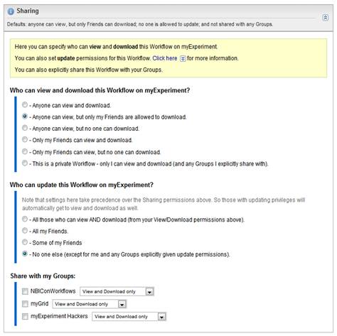
In terms of user engagement, a prime example of the use of mock-ups in evolving our design is in the development of the workflow upload page, which took seven mock-ups (all driven by users) and two different development cycles to get to the stage it is at now. This is a page that was vitally important if we were to facilitate and encourage users to upload and share their content. As well as user involvement, we also looked closely at other sites that offered content sharing and built on ideas from them (though in our case the sharing requirements were more complex and therefore we needed to do more). One important lesson we learnt in this experience is that often users see things in a very different way to the way the underlying model is structured. The underlying sharing and permissions model in myExperiment (see previous section) is highly object oriented, with User, Group, Contribution, Policy and Permission objects all working together. However, to the end user, being highly object oriented is a bad idea and usually involves taking too many unnecessary steps if the objects have to explicitly created. Instead, users wanted canned options that allowed them to quickly select the most appropriate sharing option and then we would take care of creating the underlying structure implicitly. It was tricky to achieve the right balance between simplicity and choice of options (hence the number of mock-ups). And to make things clearer, group sharing was separated from the other options at a later date, due to user feedback. See figure below.
Packs
As we developed the myExperiment software one of the requirements that kept popping up from users was the ability to upload other content apart from workflows and then link together different pieces of content for a specific purpose. As a result, we built the Packs feature to do just this. Packs allow users to collect items together, similar in principle to wish lists and shopping baskets (two metaphors that many web users are familiar with, especially users who do online shopping). As well as things within myExperiment, users were very keen on linking to external resources. Once created, a pack can be shared, tagged, discovered and so on just like workflows and files. This provides a very powerful collection/aggregation mechanism to users. See figure below.
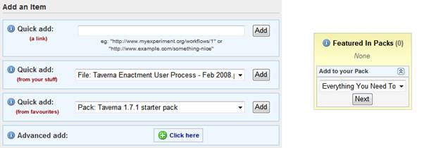
From a usability point of view it was crucial to keep the concept of packs very simple. As such we built on the idea of bookmark lists and built a user interface focused on allowing easy adding of items to a pack via just a link (URL) for both internal and external resources. This offloads the logic of resolving links and fetching metadata to the system rather than to the user. So the user doesn’t need to worry about configuring what kind of item they are adding and instead can just paste in a link to a workflow itself or to a remote resource and the system would resolve and store it appropriately. This also makes the RESTful API implementation simpler as the abstraction in the UI and API will be the same.
To make it as easy as possible to add items to a pack, we provide a number of different “quick add” options (as shown in the figure below). Furthermore, when viewing social objects that can be added to a pack we provide the option to add that social object into one of the user’s packs (also in figure below).
The ability to quick add from favourites was requested by some of our in house users and as a result we resurrected the favouring feature which was previously disabled due to feedback in the past and a lack of requirements for it. In keeping with the user engagement work, we have a list of things that users have requested for the future of packs, for example: downloading of packs, and collecting items into a temporary ‘shopping basket’ that they could then ‘checkout’ into an existing or new pack.
During the implementation of packs, we once again used consistent and familiar design patterns and metaphors, and worked closely with our users to ensure we provided a rich and enhanced user experience.
