Analysing the Network of #FLwebsci Tweets
With the University of Southampton’s first MOOC on Web Science now coming up to its second week, work has been under way to promote and discuss the new course, and – in parallel with the MOOC’s focus on the Web – a lot of this has happened on social media. I recently ran a session with Digital Marketing MSc students at the University, who were asked to post messages promoting the MOOC to their own social networks. In a follow-up session, I presented some analysis on the use of the #FLwebsci hashtag on Twitter before the MOOC had started, to demonstrate the powerful effects of marketing through the social web.
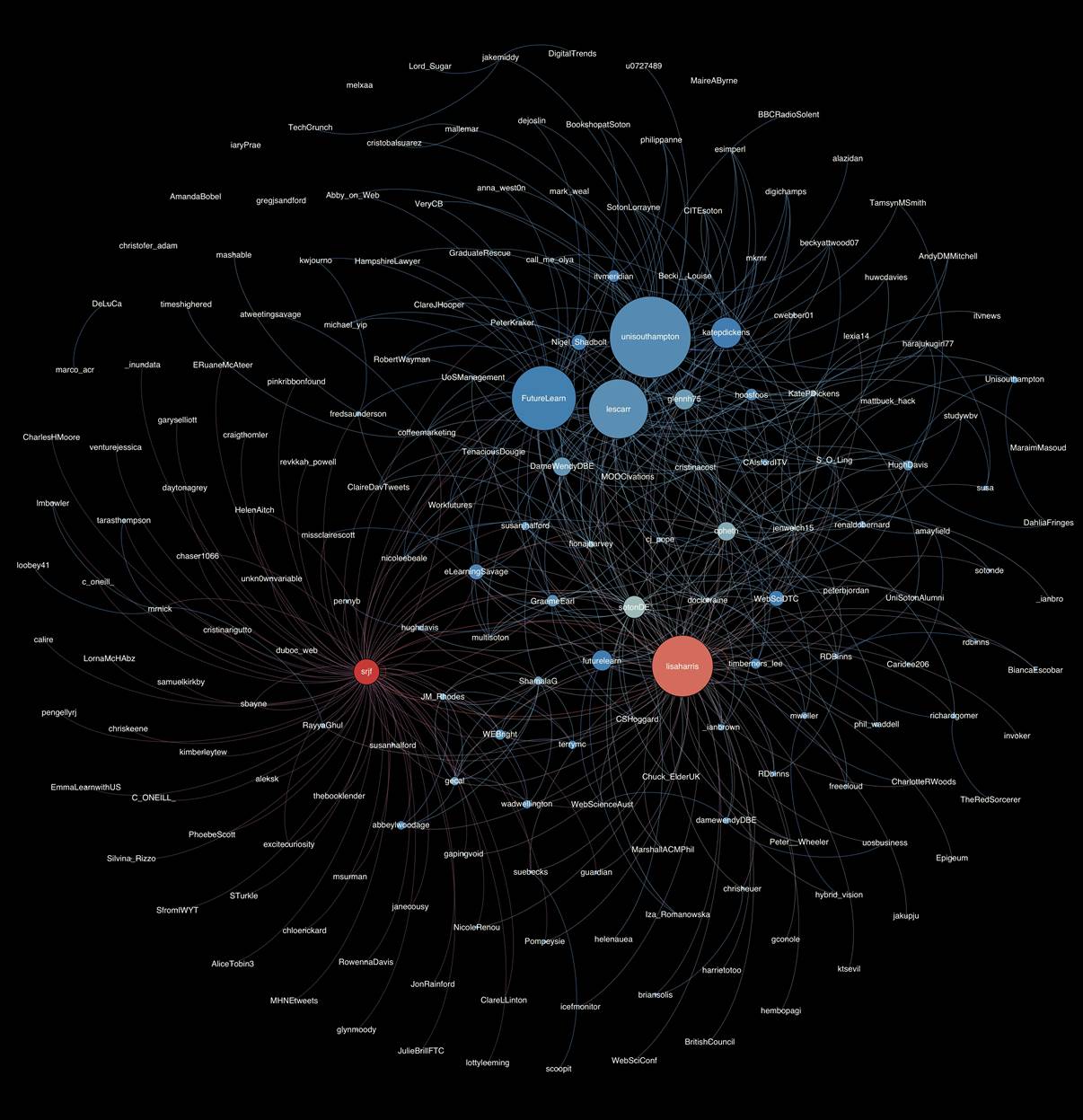
Using a Tweet Harvester run by the University, and the open source graph visualisation software Gephi, I was able to collect all tweets containing ‘FLwebsci’ and produce the network image below (click on it to load a larger, more detailed version). The size of nodes (users) relates to their in-degree – or how many times a tweet containing the hashtag mentioned them or was a retweet of their own message. The colour of nodes relates to their out-degree – or how many times that user tweeted using the hashtag – blue nodes are a low number of tweets, white nodes slightly higher, and red nodes are the highest.
You can also view a PDF of this graph.
What is surprising here is that Simon Fogg (‘srjf’) who is a registered student on the course, appears as the ‘reddest’ node, showing that he has been enthusiastically tweeting about the course. He has also produced a Google+ community around the MOOC, to further develop its presence online. This has worked as a great supporting movement to the establishment of the MOOC, and to show this, a layout algorithm was run in Gephi to arrange nodes closer to those that they are connected to. As you can see below, ‘srjf’ is connected to a large number of nodes in the left hand side of the image, who would have otherwise not been included in the network at all. This demonstrates the effect that ‘srjf‘ has had on propagating news of the MOOC and the hashtag for it to new members of the community. This is a great example of how the combination of social media and enthusiastic, devoted supporters can open up and expand the audience of a particular brand, community or organisation. Thanks must go out to Simon for the excellent work he has been carrying out in promoting the MOOC and welcoming other learners.
There will be more discussions about how network visualisations can be used for social media analysis in Week 5 of the MOOC, so if you haven’t signed up yet but are interested in this topic then head over to Futurelearn to find out more!
More details of the methodology are available on my blog too