Analysing the Twitter Network of Users Tweeting #FLwebsci
 |
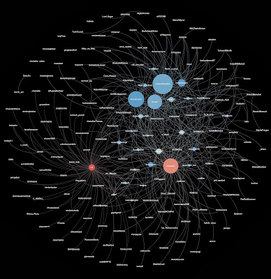
| Twitter Users Tweeting about #FLwebsci EDIT: For a larger version of this image, please see http://users.ecs.soton.ac.uk/cjp106/MOOC-Tweeters |
With the University of Southampton’s first MOOC on Web Science now coming up to its second week, work has been under way to promote and discuss the new course, and – in parallel with the MOOC’s focus on the Web – a lot of this has happened on social media. I recently ran a session with Digital Marketing MSc students at the University, who were asked to post messages promoting the MOOC to their own social networks. In a follow-up session, I presented some analysis on the use of the #FLwebsci hashtag on Twitter, to demonstrate the powerful effects of marketing through the social web.
Using a Tweet Harvester run by the University, I collected all tweets containing ‘FLwebsci’ since the FutureLearn platform and the Web Science MOOC were announced. By exporting this data into graphml format, I was able to then load a data file of user interactions into the free, open source program Gephi to begin analysis and visualisation. This is an extended, modified version of a post on the same topic on the MOOC blog, to cover more details about how to create a visualisation such as this if you are interested.
The Data
The harvester collected every tweet containing the requested hashtag since its use began. When exported into graph data, each user, or author of a tweet, is represented as a node. If the tweet they made simply mentioned the hashtag, without referring to any other user accounts, then a reciprocal edge is displayed (an edge that loops from the author node, back to the same node). If, however, the author did mention another user, whether as a passing mention, a direct reply, or a retweet, then the edge joins the author to the mentioned user. Adding more and more tweets build up a large interconnected network diagram of nodes (users) linking to each other.
Creating the Visualisation
Pulling the data into Gephi is done through exporting from the harvester into graphml format, and then opening the resulting graphml file in the Gephi program. Once loaded, Gephi displays an initial visualisation of the network. A few steps however can improve the visual appearance of the network displayed so that it can convey information quickly and easily to anyone looking at it.
Firstly, Gephi will carry out statistical calculations on the data. Using the degree (number of connections a node has) can be useful in determining what key nodes exist within a network such as this, to identify key tweeters, and also the users who are being mentioned in tandem with the hashtag. Running the degree calculation produces values for both in-degree (how many other nodes are connecting to the node, indicating they are mentioning it) and out-degree (how many tweets that nodes has made). Using these independently can reveal both these pieces of information.
Nodes were resized based on their in-degree, so that the size of each user is proportional to the number of times they were mentioned in tweets containing the hashtag. As shown in the image above (click on it to load a large version), there are large nodes for accounts such as ‘unisouthampton’, ‘futurelearn’ and ‘lescarr’, representing the official University account, the Future Learn MOOC platform, and the lead educator on the Web Science MOOC.
To display the out-degree information on the graph as well, nodes were coloured based on the number of tweets containing the hashtag that they had authored. Blue nodes represent a relatively low number of tweets sent, white nodes are moderately higher, and red nodes are those that have sent the highest number. Two red nodes, ‘lisaharris’ (who also has a high in-degree) and ‘srjf’, are immediately noticeable as the key tweeters about the MOOC, and as you can see below, ‘srjf’ - as a student on the MOOC - is connected to a large number of nodes in the left hand side of the image, who would have otherwise not been included in the network at all. This is a great example of how the combination of social media and enthusiastic, devoted supporters can open up and expand the audience of a particular brand, community or organisation.
Social Media Analysis in FLwebsci
There will be more discussions about how network visualisations can be used for social media analysis in Week 5 of the MOOC, so if you haven’t signed up yet but are interested in this post then head over to https://www.futurelearn.com/courses/web-scienceto find out more!
Update 17/11/2013 21:25 - Added a link to a larger image of the visualisation at http://users.ecs.soton.ac.uk/cjp106/MOOC-Tweeters for zooming and panning to see the users better.
Update 17/11/2013 21:25 - Added a link to a larger image of the visualisation at http://users.ecs.soton.ac.uk/cjp106/MOOC-Tweeters for zooming and panning to see the users better.
